

The Sent Email Page
After sending an email, click it from your Emails list. You’ll see these tabs:- Details — the delivery cards, the engagement chart, how this send compares with your recent ones, and the links people clicked
- Recipients — every recipient and what happened to their copy
- Registrations — who signed up for a Planning Center registration you linked to (see Registration Stats)
- Groups — who joined a Planning Center group you linked to or sent to (see Group Stats)
- Content — the email exactly as it was sent
When Metrics Update
While an email is sending, and for about an hour after it finishes, the numbers are counted live — they appear as delivery, open, and click events arrive, and refresh on their own. A blue Live metrics note tells you when you’re looking at those. After that first hour, metrics are refreshed every 5 minutes. If a send is waiting on its first refresh, the page says so rather than showing you a silent zero.Opens and clicks keep arriving for hours — often days — after a send. A number
you read twenty minutes in is a real number, but it isn’t the final one.
If a sent email would skew your organization’s dashboard totals, you can hide it from global metrics without losing this page’s stats. See Archiving Emails vs. Hiding from Global Metrics.
How Many People You Actually Sent To
Directly above the delivery cards is one line: Sent to 2,412 of 3,700 on the list. The first number is how many messages actually went out. The second is how many people your audience resolved to. When those two don’t match, click Who wasn’t sent to for the breakdown. Common reasons:The breakdown also counts people removed while the list was being prepared, so
its total can be larger than the gap in the line above it. Everyone the send
skipped is in there, whichever step dropped them.
The Delivery Cards
Three cards lead the page — Delivered, Opened, and Clicked — with the rate as the big number and the count it came from underneath. Click any card to see exactly those people on the Recipients tab.Delivered
The share of your sent messages that reached an inbox, with the raw figures underneath (141 of 144 sent). If a send is old enough that no delivery count was recorded, the card marks itself estimated and shows sent minus bounces instead.Opened
The share of sent messages that were opened, counting recipients, not opens. Someone who opens your email six times counts once. Churches tend to run high here — 40–60% is common — but treat it as a trend, not a headcount. See Open Rates Explained.Clicked
The share of recipients who clicked at least one link. It counts people, not clicks: someone who clicks five links, or the same link five times, counts once. That’s why it can never pass 100%, and why the number on this card is exactly the number of names on the Recipients tab when you click it.All three cards divide by the same number — messages sent — so they can be
read against each other. Bounces, unsubscribes, and complaints use the same
sent total.
The comparison chip
On Opened and Clicked, a small chip compares this send with your own recent average — for example, ↑ 12 pts vs last 10. It appears once you have at least three previous sends to average; below that, one unusual email moves the average too much to be worth showing.The Rest of the Delivery Picture
Beneath the three cards sit four counts, each with its rate underneath.Didn’t open
Everyone who received the email and never opened it, as a share of delivered. Underneath the row sits Send a follow-up to people who didn’t open — see Send a Follow-up to People Who Didn’t Open.Unsubscribed
People who unsubscribed or updated their preferences after this email, as a share of sent. The number turns yellow above 0.2% and red above 0.5%.Bounced
Messages that couldn’t be delivered. Yellow above 0.5%, red above 1%. See Bounce Types.Complaints
People who marked the email as spam. Yellow above 0.01%, red above 0.05%.Some providers, including Gmail, don’t report complaints back to senders. Your real complaint rate may be higher than what’s shown.
Filtering Out Bot Activity
Beside the sent line is a Filter bot activity switch. It hides opens and clicks that look automated — security scanners and inbox privacy services (like Apple Mail Privacy Protection) that open an email within moments of delivery.- Anyone who later opened or clicked on their own still counts. Real engagement is never hidden.
- Filtered recipients come out of the sent and delivered totals too, so one excluded bot makes both sides of every rate exactly one smaller.
- Unsubscribe, bounce, and complaint rates keep the full sent total, since a bot never appears in those numbers to begin with.
- The switch only changes what’s displayed. Nothing is deleted.
- The Compared to your recent emails section and the comparison chips are always unfiltered on both sides, so turning the filter on can’t make a send look better than the emails it’s measured against.
Opens and Clicks Over Time
The engagement chart plots opens and clicks together on one scale, by day or by week, so you can see when activity happened and how long the tail ran. Clicks are usually far smaller than opens and will often sit close to the baseline. That’s the true relationship — the chart deliberately doesn’t stretch clicks onto a second scale to make the two lines look comparable.Compared to Your Recent Emails
Underneath the chart, Compared to your recent emails puts this send’s open and click rates against the 10 emails you sent before it. Each row shows this email as a filled bar, with two marks on the same track: your average across those sends, and your best. It needs at least three previous sends to appear. Both rows share one scale, so an open rate and a click rate are measured by the same ruler.“Is 32% good?” has no universal answer, but it has a local one. This section
is your own congregation’s baseline, not an industry benchmark.
Links
The Links section lists every link in your email that someone clicked.- Link — the destination page’s own title where we can read it, otherwise the text you used in the email, with the site’s favicon. The full URL sits underneath in smaller type.
- People — how many recipients clicked that link at least once, with the total number of clicks underneath. 12 clicks from 7 people is usually the interesting part.
- Share — that link’s share of all the clicking on this email. The column adds up to 100%.
Who clicked what
Click any row to see which recipients clicked that link, with their name, email address, and when they clicked. It’s the fastest way to follow up with the people who showed interest in one specific thing.How link tracking works
Flowforth uses your sending domain for tracking links, so the URLs in your email match your from address. That helps with deliverability, since providers trust emails where the links and the sender agree. You can turn open and click tracking on or off per domain in your domain settings.When Tracking Is Off
If a sending domain has open or click tracking turned off, nothing was ever recorded — and a zero would be a lie. So instead:- Opened and Clicked say Open tracking was off when this email was sent / Click tracking was off when this email was sent rather than 0%.
- The engagement chart and the Links table say the same thing in place of an empty chart or table.
- The Groups and Registrations tabs still count joins and signups, and say plainly that they can’t attribute them to a click.
When We Didn’t Record It
Where that leaves no answer either way, the send’s tracking state is simply not recorded — which is a gap in our notes, not a finding about the email. Those sends show their real numbers everywhere: the Opened and Clicked cards, the engagement chart, the Links table, the click overlay on the Content tab, the comparison against your recent emails, and the click-based counts on Groups and Registrations. A quiet note sits beside them — Tracking state wasn’t recorded for this send, so this may be under-counted — because a send with tracking genuinely off would produce the same numbers. The one exception is follow-ups. “The people who didn’t open it” is a list of names to mail, not a figure to read, so that audience takes a confirmed on and nothing less. On a send whose tracking state was never recorded, the Didn’t open card and its follow-up link aren’t shown, and in the follow-up dialog the audiences that depend on tracking are unavailable with the reason on the option.The Details Sidebar
Everything about the send that isn’t a metric lives in the sidebar (or the Info tab on smaller screens):- Send — status, date, who sent it, who approved it, and when it was archived
- Message — from name and address, reply-to, subject, and preview text
- Audience — the recipient count, the lists, groups, registrations, or people it went to, and the email’s category
- Announcements — any linked Church Center or Publishing announcement
Recipients Tab
The Recipients tab is a searchable, filterable table of everyone the email was addressed to. You can search by name or email, filter by delivery status, and export to CSV.Recipient Statuses
Did Not Send
“Did Not Send” means the person was on your list but was filtered out before sending — the same people counted in Who wasn’t sent to. They’re hidden from the Recipients tab by default. To see them, add the Did Not Send Recipients filter and choose:- Show — list them alongside everyone else
- Show Only — list only the recipients that did not send
- Hide — leave them out (the default)
Per-Recipient Event Timeline
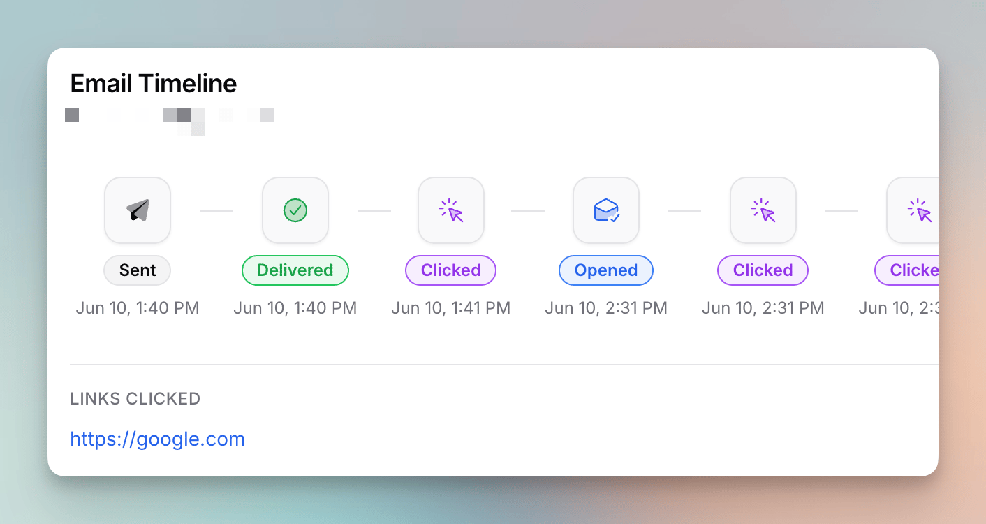
Filtering from the cards
Clicking any card at the top of the Details tab — Delivered, Opened, Clicked, Didn’t open, Unsubscribed, Bounced, Complaints — jumps you to the Recipients tab filtered to those people.Exporting Recipients
Click Export on the Recipients tab to download a CSV of all recipients, including name, email address, delivery status, and timestamps. You’ll get an email with a download link when it’s ready, and the link expires after 7 days. See Exporting Recipients.Seeing Clicks on the Email Itself
On the Content tab, turn on Show clicks to draw each tracked link’s click count directly onto the email as it was sent. It’s the quickest way to see which button in a long newsletter actually did the work.- The counts match the Links table, including the bot filter if you have it on.
- If the same URL appears in more than one place, every copy shows the same combined total — we can’t tell two identical links apart by position.
- The switch is off by default, and it changes nothing about the stored email.
Send a Follow-up to People Who Didn’t Open
Some people miss an email the first time. A follow-up is a new draft addressed only to the part of an earlier send that didn’t engage with it — most often the people who never opened it. Start one from a sent email: the ⋯ menu has Send a follow-up…, and the same thing sits as a link under the Didn’t open card.Choosing who it goes to
Three audiences are offered:- Didn’t open — received the email, no open recorded.
- Didn’t click — received or opened it, but never clicked a link.
- Opened but didn’t click — opened it, but never clicked a link.
The number is an estimate
The dialog shows About 412 people · recalculated when you send, and it means both halves of that. The audience isn’t a list of names copied into a draft. It’s a rule — “whoever didn’t open email #1,208” — that is worked out again at the moment you actually send. Opens keep arriving in the meantime, so someone who reads the original tomorrow is simply no longer in the follow-up. Unsubscribes, bounces, suppressed addresses and duplicates are all filtered again on the way out, exactly as they are on any other send.Wait about two days
If the original went out less than 48 hours ago, the dialog says so and suggests waiting. Opens keep coming in for days, and a follow-up sent the same evening mostly reaches people who hadn’t got to it yet. That’s a suggestion, and you can send through it. There is one hard limit underneath it: a follow-up can’t be built or sent within 12 hours of the original. That early, almost nobody has opened anything yet, so “the people who didn’t open it” would be very nearly everyone the email went to — including a follow-up you scheduled, which is checked again at the moment it sends.What you get
A draft, and nothing more — nothing is sent until you send it. It copies the original’s content, subject, from address, footer and announcement settings, and lands in the same folder as the original. Most people change the subject line before sending; that’s usually the point of sending again. In the draft’s To section the follow-up audience appears as a locked chip naming the original email. It is the draft’s whole audience: while the chip is there, there is no recipient selector and no CSV tab, because a follow-up can’t be mixed with other lists — “the people who didn’t open it” plus a list is a second copy of the email delivered to people the label never described, so a send that somehow carries both is refused. Removing the chip turns the draft back into an ordinary email in every respect: the recipient selector comes back, and the Follow-up badge, the Follow-up to ”…” line and its place in the original’s Follow-ups panel all go with it, and it counts toward your averages again. You can’t put the audience back from there — you’d start a new follow-up from the original.Finding them later
- The original’s sidebar grows a Follow-ups panel listing each one, with its status and how it did.
- The follow-up’s sidebar mirrors it with a Follow-up of panel: the original’s subject (linked), when it went out, how many it reached and what share opened it, and which audience this follow-up targets. The original’s numbers are what make the follow-up’s own mean anything.
- The follow-up’s own page also says Follow-up to ”…” under its title, linking back.
- In the emails list, a follow-up carries a Follow-up badge beside its status.
Follow-ups and your averages
Follow-ups are left out of the Compared to your recent emails baseline, in both directions: they never count toward your average, and a follow-up’s own page shows no comparison at all. Its audience is by construction the least engaged slice of an earlier list, so its rates aren’t measuring the email.A follow-up can’t itself be followed up. One round of “try again” is the design; a second would be a third message to the people least interested in the first. Archived emails and templates can’t be followed up either.
Understanding Your Metrics
What’s a Good Open Rate?
Churches and religious organizations tend to have some of the highest open rates of any industry, often averaging 40–60%. Church audiences are highly engaged and have actively opted in.- 40%+ is typical for churches
- 25–40% may indicate room for improvement
- Below 25% may indicate deliverability issues or content that isn’t resonating
Apple Mail Privacy Protection can inflate open rates by preloading email content even when nobody read it. Keep that in mind, and lean on clicks when the answer matters.
Improving Your Metrics
- Write better subject lines — Keep them short, specific, and relevant. “This Sunday: Guest Speaker + Potluck” performs better than “Weekly Update.” Use the
@first-namemerge tag to personalize when it makes sense. - Send at the right time — Test different days and times. Many churches find mid-week mornings work well for newsletters, while time-sensitive announcements should go out as soon as possible.
- Send consistently — Pick a schedule and stick to it. People expect and look for emails that arrive on a regular cadence. Inconsistent sending can lead to lower engagement or higher unsubscribes when emails do arrive.
- Use categories effectively — Let people subscribe to the types of emails they care about (e.g. Kids Ministry, Students, General). Targeted emails get better engagement than sending everything to everyone.
- Keep your lists clean — Review bounced addresses periodically and make sure your Planning Center lists are up to date. Sending to invalid addresses hurts your sender reputation.
- Make it scannable — Use headings, short paragraphs, and clear calls to action. People skim emails, so put the most important information first.
- Keep it relevant — If more than half of your email doesn’t apply to the reader, they’ll stop reading your emails altogether. A Kids Ministry parent doesn’t need to read about the Men’s Retreat, and vice versa.
- Include a clear call to action — Every email should have something for the reader to do, whether that’s registering for an event, watching a video, or just knowing about a schedule change.
If you have questions about interpreting your stats or want help improving performance, reach out to support@flowforth.co.