

Metrics Overview
At the top of the dashboard, you’ll see four key metrics for your organization:- Emails Sent: The total number of recipients you sent to during the selected time period.
- Open Rate: The percentage of the emails you sent that were opened. The tile’s subtitle shows the number of opens.
- Click Rate: The percentage of the people you sent to who clicked at least one link in your emails. It counts people, not clicks — the tile’s subtitle shows how many distinct clickers that was. See Email Metrics.
- Unsubscribe Rate: The percentage of the people you sent to who unsubscribed, with the number of unsubscribes underneath.
Filtering by Time Period
You can adjust the time period for your metrics using the filter at the top of the dashboard. Choose from:- 24 hours
- 7 days
- 30 days
- Year
- All time
Performance over time
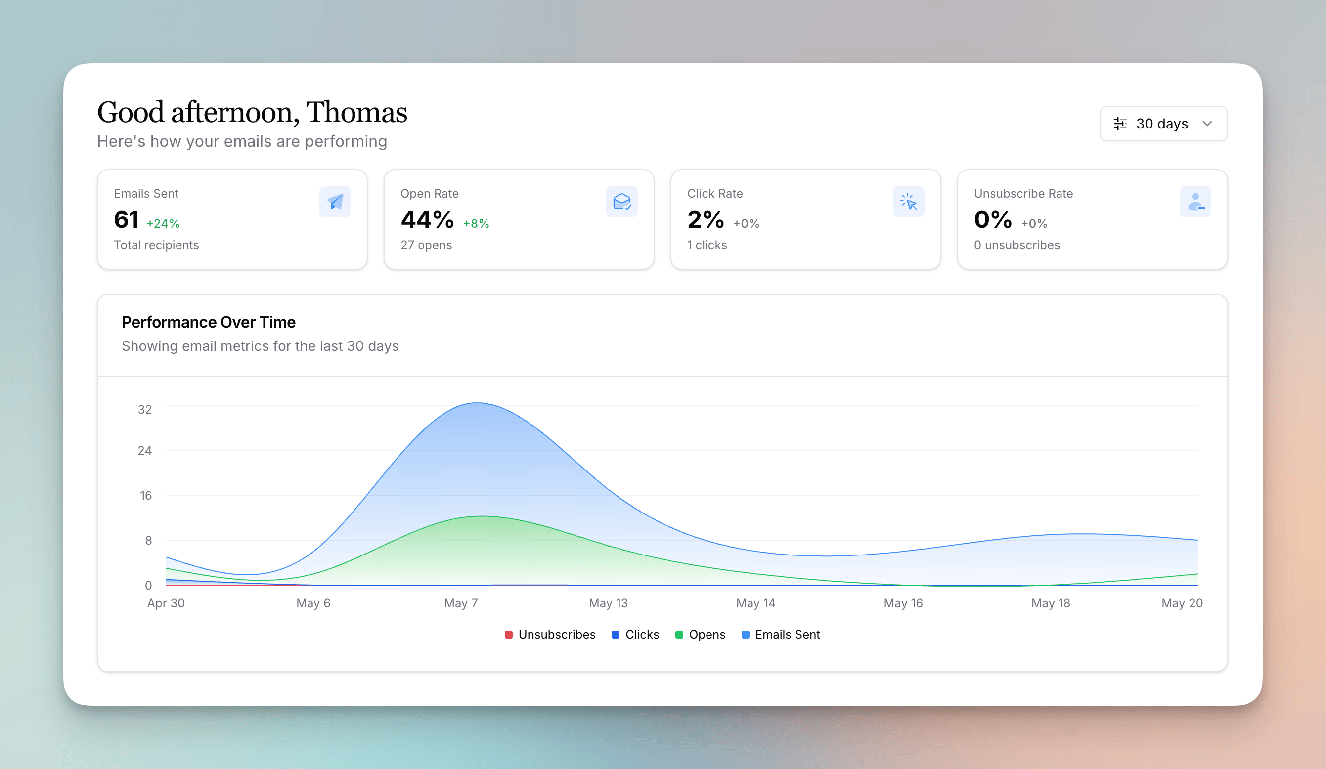
- Emails Sent
- Opens
- Clicks
- Unsubscribes
Unsubscribes Tab
The dashboard has two tabs: Overview — everything above — and Unsubscribes, the full reporting on people who opted out. It reads the same time period filter at the top of the page. Three tiles lead the tab:- Unsubscribes: how many people unsubscribed in the period.
- Responses: how many of them told you why, with the share that left a reason underneath.
- Top reason: the reason people picked most, with its share of the responses.
- Unsubscribes over time: a chart of people who unsubscribed from all emails, counted on the day they unsubscribed. Category unsubscribes aren’t included.
- Reasons: what people picked when they unsubscribed, with each reason’s share of the responses. Other — the free-text choice — is always listed last. Manage reasons, in the card’s header, opens the settings where you edit the list.
- Responses: every reason and comment left on your unsubscribe page, newest first, with the Date, Person, Reason, and Comment for each one. Person links to that person’s page in Flowforth, with a link to their Planning Center profile when we know it. Search by email address, click a row to read the whole response, and keep scrolling to load more.
Exporting
Export, beside the Responses search, downloads either file for the period you’re looking at:- Export responses (CSV) — one row per response, with Date, First name, Last name, Email address, Planning Center ID, Planning Center profile, Flowforth profile, Reason, Comment, and Email subject. Whatever you’ve typed into the search applies to the file too. One export holds up to 10,000 responses, newest first, and Flowforth tells you when there were more.
- Export reason totals (CSV) — one row per reason with its count. The totals are worked out from the most recent 5,000 responses in the period; narrow the time period for exact numbers on a busier window.
The Unsubscribes tab needs people access, since each response is tied to the person who left it. The Unsubscribe Rate card on Overview carries a link into the tab — its count of unsubscribes — for anyone who has it.
Recent Emails
The dashboard displays your most recent emails, including drafts, scheduled emails, and sent emails. This makes it easy to pick up where you left off or check the status of a recent send. You can also start a new email or a new email template directly from the dashboard using the quick create options.Email Usage Tracker
The dashboard shows how many email sends you’ve used in your current billing cycle and how many you have remaining. This helps you plan your sending and avoid running out of sends before your cycle resets.Recent Email Activity
This card shows your most recent unsubscribe and bounce events. Each entry includes:- The person’s name and email
- The event type (bounce, unsubscribe, or category unsubscribe)
- The email or automation that triggered it
- The category name if it was a category unsubscribe
This card needs people access. Members without it don’t see it on the dashboard, the same way they can’t open the People Feed itself.
Search Everything with the Command Palette
Press ⌘K (Mac) or Ctrl+K (Windows) from any main page of Flowforth to open the search palette — or click the search button at the top of the sidebar. It’s the fastest way to find something or jump to a page without clicking through menus. Start typing and the palette searches across your emails, templates, folders, categories, link pages, QR codes, people, Planning Center lists, automations, and teams all at once, ranked by relevance. Use the section filters at the top (All, Emails, Templates, People, Links, Automations) to narrow results to just one area. The palette also doubles as a launcher:- Jump to any page — type a page name (like “Categories” or “Domains”) to go straight there.
- Quick create — kick off a new email, new template, or new QR code right from the results.
- Toggle theme — switch between light and dark mode without leaving the palette.
- Log out — sign out of Flowforth right from the results.
⌘K used to open Help & Support — it now opens search. You can still open the Help & Support sheet from the sidebar any time.
Hiding Emails from Global Metrics
If you send a one-off email that you don’t want to affect your overall stats, you can hide it from your global metrics. See Archiving Emails vs. Hiding from Global Metrics for step-by-step instructions and how this differs from archiving.Need help with your dashboard? Contact support@flowforth.co.