> ## Documentation Index
> Fetch the complete documentation index at: https://help.flowforth.co/llms.txt
> Use this file to discover all available pages before exploring further.
# Email Styles
> Customize the look and feel of your emails with global styles, block defaults, and color tools.
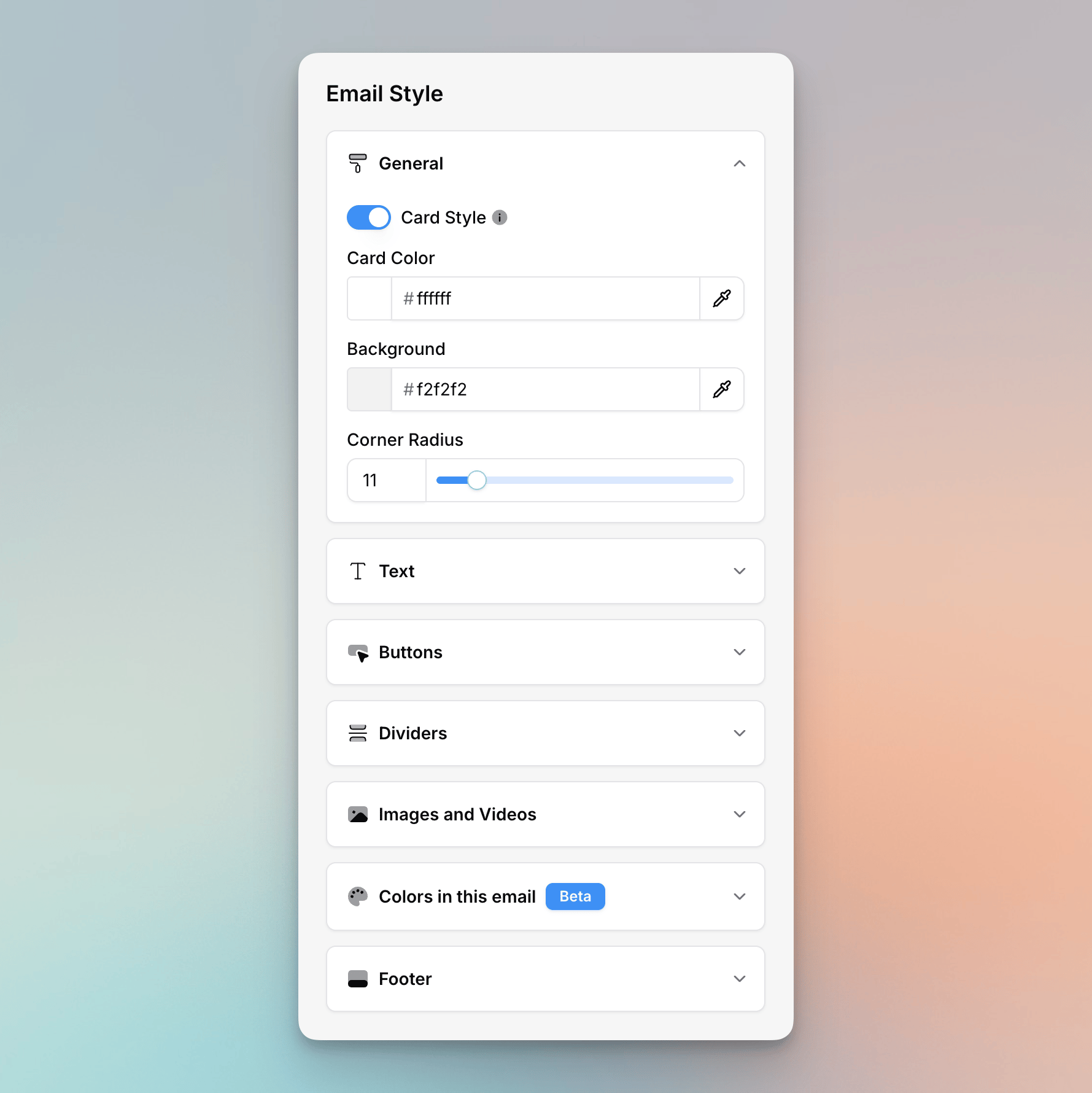
Flowforth's email style system lets you control the visual design of your entire email from one place. Open the **Styles** panel in the email editor sidebar to access all of the options below.
All styles set here act as defaults and can be overridden on any individual block. This includes text formatting, font, size, colors, alignment, rounding, and more.
 ***
## General Styles
### Card Style
Toggle **Card Style** on to give your email content area a distinct background color that sits on top of the outer email background. This creates a "card" look — a colored content area floating on a contrasting background.
* **Content Background**: The color of the card / content area
* **Email Background**: The color behind the card (visible on the sides and top/bottom)
When card style is off, only the content background color is used.
### Rounded Corners
When card style is enabled, use the **Rounded Corners** slider to adjust the border radius of the content area (0–20px). This value is also used as the default corner radius for blocks that don't have their own rounding setting, keeping your email visually consistent.
***
## Text Defaults
The **Text** section lets you set default styles for each text element type: **Heading 1**, **Heading 2**, **Heading 3**, and **Paragraph**. For each element, you can configure:
* **Font** — Choose from supported font families
* **Color** — Set the default text color
* **Font Size** — Adjust the size (in pixels)
* **Bold / Italic / Underline** — Toggle formatting
* **Alignment** — Left, center, or right
You can also set:
* **Accent Text Color** — Used for accent-colored text in your email
* **Link Color** — The color applied to all links
Changes to text defaults apply immediately to all text blocks in your email. When you add new text blocks, they will use these defaults automatically.
***
## Button Defaults
Set default styles for all button blocks in your email:
* **Color** — The button background color (or border color for outline style)
* **Text Color** — The button label color
* **Style** — Choose between **Filled** or **Outline**
* **Padding** — Horizontal and vertical padding
* **Font Size** — The button text size
* **Border Radius** — Rounded corners on buttons
* **Alignment** — Left, center, or right
### Apply to All Buttons
Click **Apply to all buttons** to reset every button in your email (including buttons inside columns and cards) to the current defaults. This overrides any per-button customizations.
### Set as Default (from a block)
You can also set defaults from an individual button block. Select a button, customize it how you'd like, then click **Set as default**. This will:
1. Save that button's style as the new default
2. Update all other buttons that were still using the previous defaults
3. Leave any buttons you had manually customized differently untouched
### Reset to Default
When editing an individual button that has been customized away from the defaults, click **Reset to default** to snap it back to the current default style.
***
## Divider Defaults
Control the default appearance of divider blocks:
* **Color** — The divider line color
* **Thickness** — The line thickness in pixels (0-100). A thickness of 0 turns the divider into a spacer.
* **Style** — Choose between **Solid**, **Dashed**, or **Dotted** line styles
**Apply to all dividers** and **Set as default** / **Reset to default** work the same way as button defaults.
***
## Images and Videos Defaults
Set default styles for image and video blocks:
* **Size** — Image width as a percentage (0–100%)
* **Alignment** — Left, center, or right
* **Border Radius** — Rounded corners on images
* **Border Color** — Optional border color
* **Border Width** — Optional border thickness. Supports per-side widths (top, right, bottom, left).
**Apply to all images** and **Set as default** / **Reset to default** work the same way as button defaults.
Video blocks share the same default style settings as images. Changing image
defaults will also apply to new video blocks.
***
## Cards Defaults
Set the default look of [cards](/emails/editor/cards-block) blocks so every card in your email starts from the same style:
* **Text Color** — The color of a card's title and description
* **Label Color** — The color of the small label above a card's title
* **Button Color** — The card button's background color (or border color for outline style)
* **Button Text Color** — The card button's label color
* **Button Style** — Choose between **Filled** or **Outline**
* **Button Size** — **Fit**, **Full**, or **Large**
* **Button Alignment** — Left or centered
* **Image Ratio** — The aspect ratio of a card's image: **16:9**, **1:1**, or **Original**
* **Content Alignment** — Align the card's content **Left** or **Center**
**Apply to all cards** and **Set as default** / **Reset to default** work the same way as button defaults.
This is different from the **Card Style** setting under [General Styles](#card-style),
which frames your whole email in a background color. Cards Defaults control the
individual cards blocks you add to your content.
***
## Colors in this Email
The **Colors in this Email** section shows all colors currently used across your email. You can use it to swap one color for another across the entire email at once, which is useful when rebranding or adjusting your color palette.
It scans all style properties — backgrounds, text colors, button colors, divider colors, image borders, link colors, accent colors, and footer link colors — and replaces every instance of the old color with the new one.
To replace a color:
1. Open **Colors in this Email** in the Styles panel
2. Click the color you want to replace
3. Choose the new color
4. Click **Replace** to apply the change everywhere
***
## Footer
Control the colors used in your email footer:
* **Footer Background** — The background color of the footer area (only available when card style is off)
* **Footer Title** — The color of footer title text
* **Footer Text** — The color of secondary/body text in the footer
* **Footer Links** — The color of links in the footer
To edit the footer content itself (text, logo, social links), see [Default Footer](/emails/default-footer).
***
## How Defaults Work
* **Per-email**: Style defaults are stored with each individual email. Changing defaults on one email does not affect other emails.
* **New blocks inherit defaults**: When you add a new block (button, divider, image, or text), it automatically uses the current defaults.
* **Templates carry styles**: When you save an email as a template, its style defaults are included. Applying a template's style will bring over all of its defaults.
***
## General Styles
### Card Style
Toggle **Card Style** on to give your email content area a distinct background color that sits on top of the outer email background. This creates a "card" look — a colored content area floating on a contrasting background.
* **Content Background**: The color of the card / content area
* **Email Background**: The color behind the card (visible on the sides and top/bottom)
When card style is off, only the content background color is used.
### Rounded Corners
When card style is enabled, use the **Rounded Corners** slider to adjust the border radius of the content area (0–20px). This value is also used as the default corner radius for blocks that don't have their own rounding setting, keeping your email visually consistent.
***
## Text Defaults
The **Text** section lets you set default styles for each text element type: **Heading 1**, **Heading 2**, **Heading 3**, and **Paragraph**. For each element, you can configure:
* **Font** — Choose from supported font families
* **Color** — Set the default text color
* **Font Size** — Adjust the size (in pixels)
* **Bold / Italic / Underline** — Toggle formatting
* **Alignment** — Left, center, or right
You can also set:
* **Accent Text Color** — Used for accent-colored text in your email
* **Link Color** — The color applied to all links
Changes to text defaults apply immediately to all text blocks in your email. When you add new text blocks, they will use these defaults automatically.
***
## Button Defaults
Set default styles for all button blocks in your email:
* **Color** — The button background color (or border color for outline style)
* **Text Color** — The button label color
* **Style** — Choose between **Filled** or **Outline**
* **Padding** — Horizontal and vertical padding
* **Font Size** — The button text size
* **Border Radius** — Rounded corners on buttons
* **Alignment** — Left, center, or right
### Apply to All Buttons
Click **Apply to all buttons** to reset every button in your email (including buttons inside columns and cards) to the current defaults. This overrides any per-button customizations.
### Set as Default (from a block)
You can also set defaults from an individual button block. Select a button, customize it how you'd like, then click **Set as default**. This will:
1. Save that button's style as the new default
2. Update all other buttons that were still using the previous defaults
3. Leave any buttons you had manually customized differently untouched
### Reset to Default
When editing an individual button that has been customized away from the defaults, click **Reset to default** to snap it back to the current default style.
***
## Divider Defaults
Control the default appearance of divider blocks:
* **Color** — The divider line color
* **Thickness** — The line thickness in pixels (0-100). A thickness of 0 turns the divider into a spacer.
* **Style** — Choose between **Solid**, **Dashed**, or **Dotted** line styles
**Apply to all dividers** and **Set as default** / **Reset to default** work the same way as button defaults.
***
## Images and Videos Defaults
Set default styles for image and video blocks:
* **Size** — Image width as a percentage (0–100%)
* **Alignment** — Left, center, or right
* **Border Radius** — Rounded corners on images
* **Border Color** — Optional border color
* **Border Width** — Optional border thickness. Supports per-side widths (top, right, bottom, left).
**Apply to all images** and **Set as default** / **Reset to default** work the same way as button defaults.
Video blocks share the same default style settings as images. Changing image
defaults will also apply to new video blocks.
***
## Cards Defaults
Set the default look of [cards](/emails/editor/cards-block) blocks so every card in your email starts from the same style:
* **Text Color** — The color of a card's title and description
* **Label Color** — The color of the small label above a card's title
* **Button Color** — The card button's background color (or border color for outline style)
* **Button Text Color** — The card button's label color
* **Button Style** — Choose between **Filled** or **Outline**
* **Button Size** — **Fit**, **Full**, or **Large**
* **Button Alignment** — Left or centered
* **Image Ratio** — The aspect ratio of a card's image: **16:9**, **1:1**, or **Original**
* **Content Alignment** — Align the card's content **Left** or **Center**
**Apply to all cards** and **Set as default** / **Reset to default** work the same way as button defaults.
This is different from the **Card Style** setting under [General Styles](#card-style),
which frames your whole email in a background color. Cards Defaults control the
individual cards blocks you add to your content.
***
## Colors in this Email
The **Colors in this Email** section shows all colors currently used across your email. You can use it to swap one color for another across the entire email at once, which is useful when rebranding or adjusting your color palette.
It scans all style properties — backgrounds, text colors, button colors, divider colors, image borders, link colors, accent colors, and footer link colors — and replaces every instance of the old color with the new one.
To replace a color:
1. Open **Colors in this Email** in the Styles panel
2. Click the color you want to replace
3. Choose the new color
4. Click **Replace** to apply the change everywhere
***
## Footer
Control the colors used in your email footer:
* **Footer Background** — The background color of the footer area (only available when card style is off)
* **Footer Title** — The color of footer title text
* **Footer Text** — The color of secondary/body text in the footer
* **Footer Links** — The color of links in the footer
To edit the footer content itself (text, logo, social links), see [Default Footer](/emails/default-footer).
***
## How Defaults Work
* **Per-email**: Style defaults are stored with each individual email. Changing defaults on one email does not affect other emails.
* **New blocks inherit defaults**: When you add a new block (button, divider, image, or text), it automatically uses the current defaults.
* **Templates carry styles**: When you save an email as a template, its style defaults are included. Applying a template's style will bring over all of its defaults.